Introduction
The Contracts Portal is a web based version of specific BusinessCraft functions currently providing the ability to create and maintain Customers, Customer Contacts, Leads and Contracts including Events, Estimates, Documents, Job Information, Display Centre Statistics and Variation functionality.
Where BusinessCraft is used for functions beyond Contract Management, it is good practice that the Contracts Portal uses a separate BusinessCraft dataset (often referred to as the Contracts Database) for the records created so that the data is segregated from the primary BusinessCraft dataset.
The Lead Conversion Process in the target BusinessCraft Live dataset can be used to access the Customer, Customer Contact and Contract from the Contracts Database (the source) and create those records in the BusinessCraft Live dataset cross referencing the Contract records in both datasets.
The Contracts Portal currently provides the following functions:
Customer, Customer Contact and Lead (Contract) details can be created and edited.
Sales Estimates can be created, edited and printed for Leads and Contracts.
Job information can be recorded for Leads and Contracts.
Document records comprising file notes with or without attachments can be linked to Leads and Contracts.
Events can be defined and registered for Leads and Contracts with required dependencies.
User defined Display Centre statistics such as weather, traffic etc. can be recorded and reviewed.
Reports can be created and generated.
Charts can be created and generated.
A user customisable Desktop is provided for key information and charts.
Dashboards can be created for additional key information and charts.
System Requirements
The following system requirements are necessary to enable use of the Contracts Portal:
Server
BusinessCraft V5.05 or later.
Synergy V10.3.1b or later with the xfServerPlus service installed & running on the BusinessCraft Server.
Microsoft .NET 4.5 Framework.
Microsoft Internet Information Server configured for the BusinessCraft Sales Portal and running on the BusinessCraft Server or the Sales Portal Server if different to the BusinessCraft Server.
If the Sales Portal is installed on a different server to the BusinessCraft Server, that server must have ODBC connectivity.
Client
Supported browsers include Chrome, Firefox, Safari and Internet Explorer. Please note that some problems may be experienced when using Internet Explorer that are beyond BusinessCraft’s control.
On login, the BusinessCraft Contracts Portal loads all required data into memory using ODBC. As users navigate from page to page, data is loaded from the data that was loaded into memory when logging in.
When a new record is added, memory is cleared and data freshly loaded. An icon is provided on the Title Bar to clear data in memory if required and reload all data using ODBC without necessitating the addition of a new record.
Please note a browser refresh, refreshes the page but does not refresh data in memory.
Navigation
Login
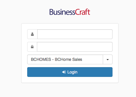
Click on the Contracts Portal icon on the desktop or if not visible, open a browser and go to the web address for the Contract Portal (URL).
Enter a username and password and if the dataset is not the one required change to the required BusinessCraft dataset and click the Login button:
On successful login, the Contracts Portal Home Page is displayed. By default, this is the Desktop as shown, however users can designate a different page to be their home page which will be displayed on login. Please note the following is an example only as the Desktop can be customised for each user:
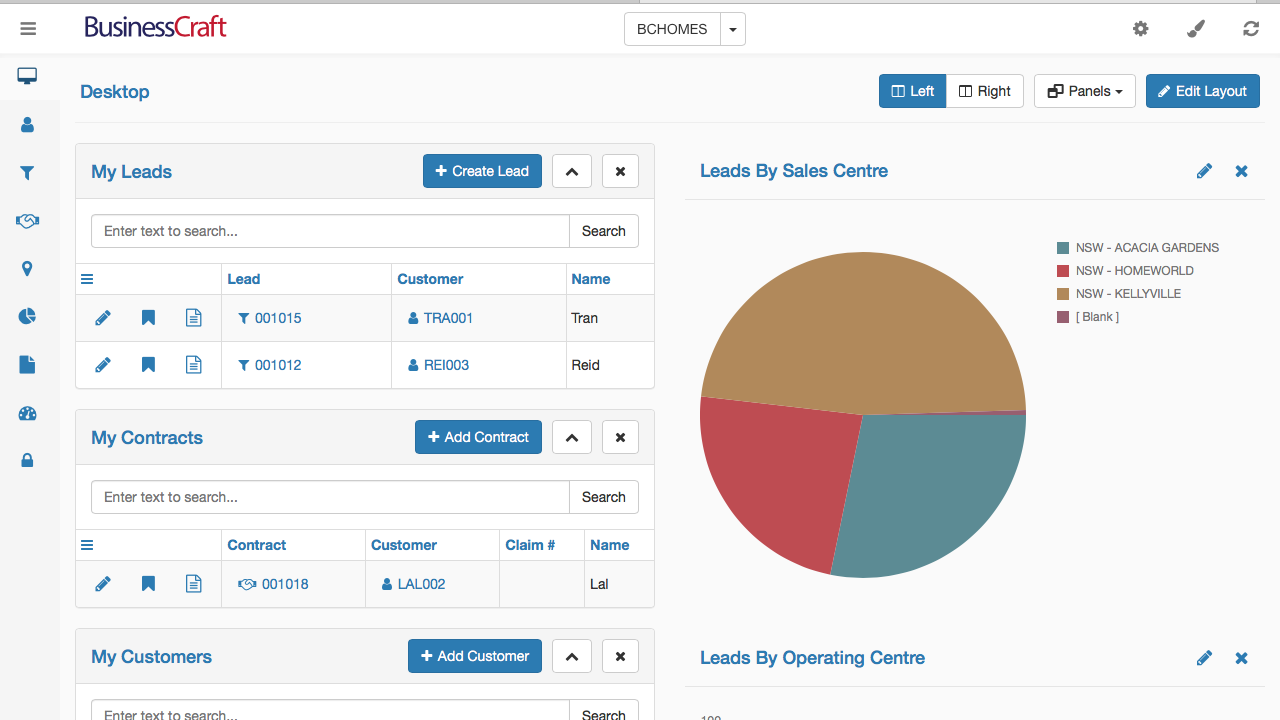
Title Bar
The Title Bar is displayed across the top of all screens in the Contracts Portal:

 |
The Hamburger icon is used to toggle the Menu Sidebar to show Icons Only or Icons and Text. |
 |
The BusinessCraft logo is for decorative purposes only. |
 |
The BusinessCraft dataset that was selected when logging in is displayed. Clicking on the dataset name will return to the Home Page. The drop-down arrow provides two options:
|
 |
The Settings wheel, when displayed, provides the ability to change settings for the currently displayed page. The options available vary depending on the page displayed and where there are no settings options for the page displayed, the Settings wheel does not appear. For the Desktop, there is a Reset Layout option which clears the current layout for the desktop. |
 |
The Paintbrush icon provides the option to select from a number of themes to be used by the Contracts Portal. When a theme is selected, it is applied automatically to all pages affecting colours and fonts. It is easy to select the Default Theme as required. |
 |
Clears data in memory and reloads memory with up to date data using ODBC. |
Menu Sidebar
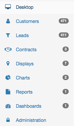
The Menu Sidebar is positioned on the left-hand side of the Contracts Portal and can be displayed with Icons and Text or Icons only using the Hamburger icon in the title Bar.
 |
 |
Each selection in the Menu Sidebar opens a different page in the Contracts Portal. Each page will be explained later in this guide.
When a page is selected, the Icon and Text (or Icon Only) in the Menu Sidebar will be highlighted. In this case, the Desktop is selected.
When the Menu Sidebar is displayed with Icons and Text, a record counter is shown for each page other than the Desktop and Administration Pages.
Data Grid
The Data Grid is positioned to the right of the Menu Sidebar and directly below the Title Bar. The Data Grid contains the data for the page selected as well as a Page Header, Column Headings, Search Facilities and/or Action buttons depending on the page displayed.
Here is an example of a Data Grid, in this case for the Leads Page:

Desktop
If the Desktop is not already displayed, click on the Desktop link in the Menu Sidebar to display the Desktop in the Data Grid. The Desktop contains a Heading Bar with the name of the page and buttons to configure the Desktop.
Below the Desktop Heading Bar, is the Desktop Data Grid comprising Panels and Charts. In this case, the desktop contains the My Leads panel, the My Contacts panel and the Leads by Sales Centre Chart.
The Desktop is highly user- customisable and the contents are user centric, so the screen shot displayed here is for explanatory purposes only.
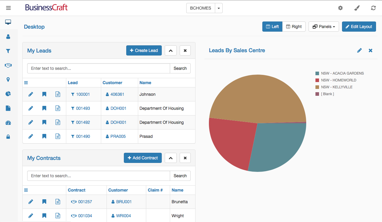
In the Desktop Heading Bar are four buttons:
 |
The Left and Right buttons are used to toggle Desktop Columns on or off. In this example, the Left button is active.
|
 |
The Panels Button provides the option to select which panels are displayed on the Desktop. Click the button to display a drop-down menu to choose from the panels available. |
 |
The Edit Layout button provides the ability to arrange panels on the Desktop to display in the required column and in the preferred order. Editing options include:
After making required changes, click the Save button to save the changes and display the Desktop. |
Here is an example of the Desktop are clicking the Edit Layout button:
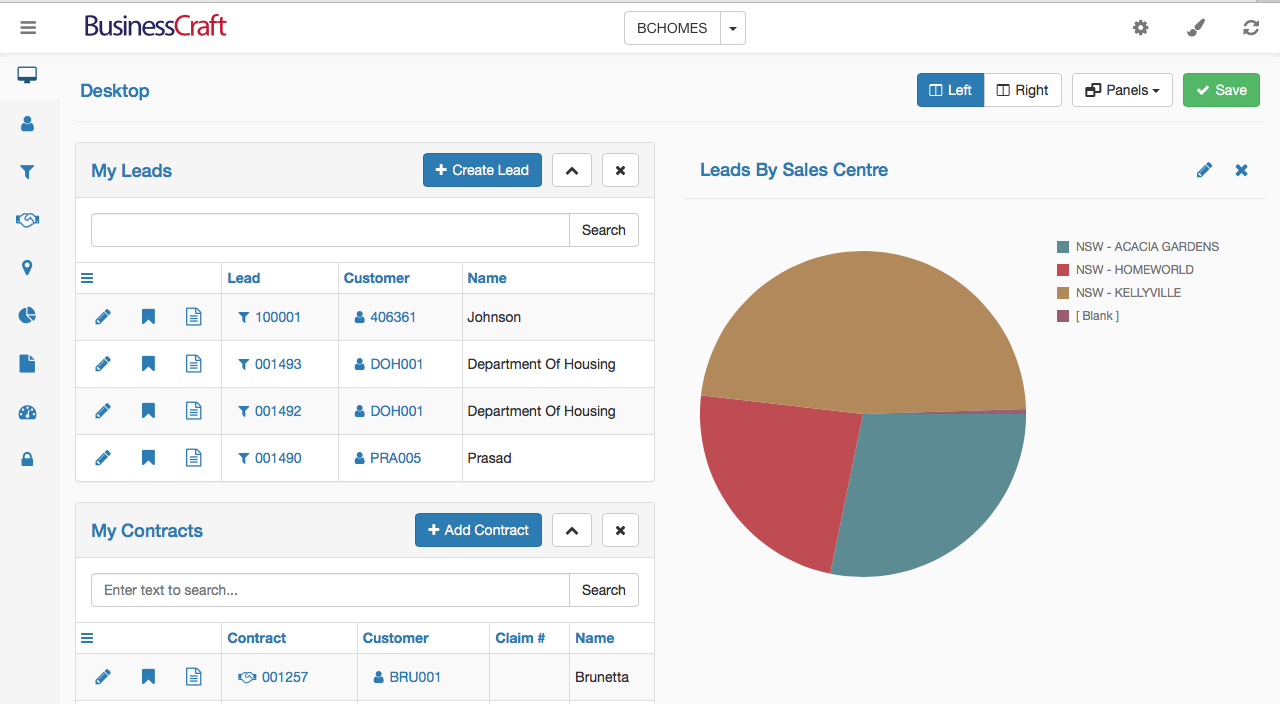
Desktop Panels
Desktop Panels provide quick reference to information of relevance to the logged user. The records that appear in any panel will need to have been bookmarked previously in the respective page for that panel.
For example, there are 4 leads showing in the My Leads panel below. These Leads were bookmarked in the Leads Page previously resulting in them appearing in the My Leads panel on the Desktop.
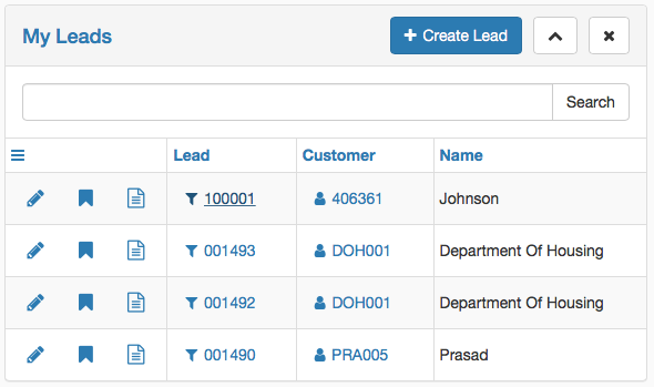
| Create Button |
Depending on the Desktop Panel, there will usually be a Create button in the Desktop panel heading to providing a quick create option. |
 |
Click the Up arrow to collapse the panel. The arrow will become a down arrow. Click the down arrow to expand the panel. |
 |
Click the x icon to remove the panel from the Desktop. |
| Search | The Search option provides a full test search of the columns in the Desktop Panel for the records displayed in the Desktop Panel. |
 |
The Hamburger icon is reserved for future use. |
| Column Headings |
Click on any Column Heading to sort records displayed in the Desktop Panel in Ascending or Descending order for that column. Drag and drop column headings to move columns locations. |
 |
The pencil opens a quick edit screen for the record. |
 |
Click on the Bookmark icon to remove the bookmark for the record which removes the record from the Desktop Panel. |
 |
Hover over the Details icon to see key information for the record without needing to open the edit screen. |
| Hyperlink Fields | Click on a record with a hyperlink to open the module for that record. E.g. click on the Lead hyperlink to open the Lead record, click on the Customer hyperlink to open the Customer record. |
Desktop Charts
Charts are created in the Charts Page and if bookmarked by the user can then be made available to be added to the Desktop.
In this example, the Leads by Sales Centre chart has been added to the Desktop.
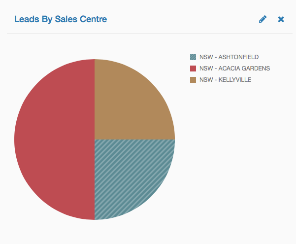
 |
Click the pencil icon to open the Chart Details screen providing the option to change the Chart Description (which shows in the Desktop Chart Panel Header), the Data Source (which can change the data displayed), the Chart Display (Pie, Doughnut, Bar, Area, Line) and the Bookmark field. |
 |
Click the x icon to remove the chart from the Desktop. |
Customers and Customer Contacts
Click on the Customers link in the Menu Sidebar to display the Customers List View in the Data Grid.
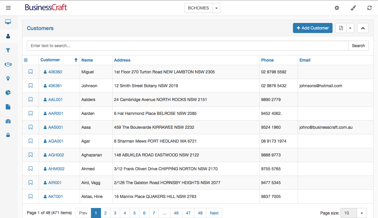
The Customers List View can be configured to show Customers or Customer Contacts. Click the Settings Wheel in the Title Bar and an option will be provided to Show Contacts if the view shows Customers. The Settings Wheel will provide the option to show Customers Only if the view currently shows Customer Contacts.
The Customers (or Customer Contacts) List View contains a Heading Bar with the name of the page, a button to Add a Customer, an Export icon (PDF, XLS, XLSX, CSV, RTF) and an icon to collapse expand the view.
Below the Heading Bar, is the Search bar, providing the ability to carry out a text search for all records (not just those on the page displayed) for matching data in any of the columns in the List View.
Below the Search Bar is the Customers (or Customer Contacts) List View Data Grid.
The Hamburger icon is reserved for future use.
Click a column to sort the data by that column.
Drag and drop column headings to reposition columns in the grid.
Click the bookmark icon for a record so that the record is displayed in its Desktop Panel
Click the Customer code hyperlink for a record to open the Customer Details screen.
At the bottom of the screen is a Navigation Bar showing the number of pages and providing an option to change the number of records shown on each page:

Customer Details Screen
After clicking on a Customer Code for a record in the Customer (or Customer Contacts) View, the Customer Details screen is displayed. The Customer Details screen will display in either Tab or List View depending on the view last selected by clicking on the Settings Wheel in the Title Bar.
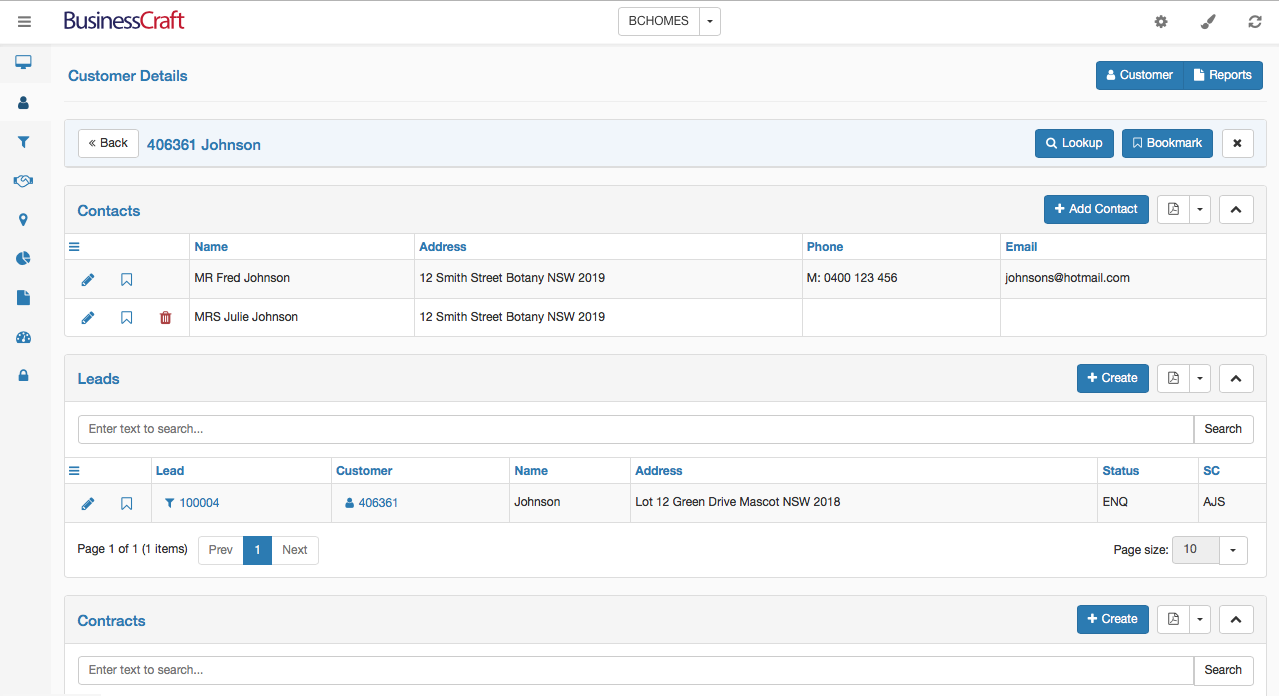
Customer Details Header
The Customer Details Header contains the name of the screen, a Customer button and a Reports button:

The Customers Button is a toggle that hides or shows the Customer Code and Name Panel that is positioned directly below the Customer Details Header. The Reports Button opens any reports created for Customers and/or Customer Contacts.
Customer Code and Name Panel
The Customer Code and Name Panel appears below the Customer Details Header and can be shown or hidden by clicking the Customer Button in the Customer Details Header or hidden by clicking the x icon in the Customer Code and Name Panel:

Click the Back button to return to the Customers List View.
Click the Lookup button to open Customer List View without leaving the Customer Details screen to quickly select another customer to be displayed in the Customer Details screen.
Click the Bookmark button to bookmark the Customer for display in the My Customers Detail Panel on the Desktop.
If List View is displayed, as in this example, below the Customer Code and Name Panel are subpanels for Contacts, Leads and Contracts for that Customer.
Contacts Tab/Panel
The Contacts Tab/Panel shows contacts for the customer.

Click the Add Contact button to add a contact for this Customer.
Click the PDF icon to export the Contacts for this Customer.
Click the Up (or Down) arrow to expand or collapse the Contacts Subpanel.
The Hamburger icon is reserved for future use.
Click a column to sort the data by that column.
Drag and drop column headings to reposition columns in the grid.
Click the pencil to open a quick edit screen for the selected contact.
Click the bookmark icon for a contact so that the contact is displayed in its Desktop Panel.
Click the trash can to delete the selected contact (the primary contact cannot be deleted)
At the bottom of the Contacts subpanel is a Navigation Bar showing the number of pages and providing an option to change the number of records shown in the subpanel.
Leads Tab/Panel
The Leads Tab/Panel shows Leads for the customer. Leads are segregated from Contracts based on a system definable parameter.

Click the Create button to create a Lead for this Customer.
Click the PDF icon to export the Leads for this Customer.
Click the Up (or Down) arrow to expand or collapse the Leads Subpanel.
The Hamburger icon is reserved for future use.
Click a column to sort the data by that column.
Drag and drop column headings to reposition columns in the grid.
Click the pencil to open a quick edit screen for the selected lead.
Click the bookmark icon for a lead so that the lead is displayed in its Desktop Panel.
Click the Lead Code to open the Lead Details screen.
Click the Customer Code to open the Customer Details screen.
At the bottom of the Leads subpanel is a Navigation Bar showing the number of pages and providing an option to change the number of records shown in the subpanel.
Contracts Tab/Panel
The Contracts Tab/Panel shows Contracts for the customer. Contracts are segregated from Leads based on a system definable parameter.

Click the Create button to create a Contract for this Customer.
Click the PDF icon to export the Contracts for this Customer.
Click the Up (or Down) arrow to expand or collapse the Contracts Subpanel.
The Hamburger icon is reserved for future use.
Click a column to sort the data by that column.
Drag and drop column headings to reposition columns in the grid.
Click the pencil to open a quick edit screen for the selected Contract.
Click the bookmark icon for a Contract so that the Contract is displayed in its Desktop Panel.
Click the Contract Code to open the Contract Details screen.
Click the Customer Code to open the Customer Details screen.
At the bottom of the Contracts subpanel is a Navigation Bar showing the number of pages and providing an option to change the number of records shown in the subpanel.
Leads
Click on the Leads link in the Menu Sidebar to display the Leads List View in the Data Grid. Leads are segregated from Contracts based on a system definable parameter.
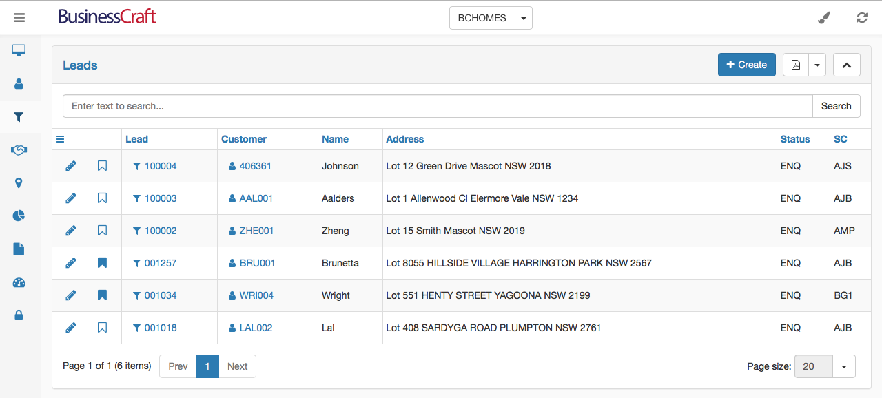
The Leads List View contains a Heading Bar with the name of the page, a button to Create a Lead, an Export icon (PDF, XLS, XLSX, CSV, RTF) and an icon to collapse expand the view.
Below the Heading Bar, is the Search bar, providing the ability to carry out a text search for all records (not just those on the page displayed) for matching data in any of the columns in the List View.
Below the Search Bar is the Leads List View Data Grid.
The Hamburger icon is reserved for future use.
Click a column to sort the data by that column.
Drag and drop column headings to reposition columns in the grid.
Click the bookmark icon for a record so that the record is displayed in its Desktop Panel
Click the Lead code hyperlink for a record to open the Lead Details screen.
Click the Customer code hyperlink for a record to open the Customer Details screen.
At the bottom of the screen is a Navigation Bar showing the number of pages and providing an option to change the number of records shown on each page:

Lead Details Screen
After clicking on a Lead Code for a record in the Leads List View, the Lead Details screen is displayed. The Lead Details screen will display in either Tab or List View depending on the view last selected by clicking on the Settings Wheel in the Title Bar.
When in Tab view, the Lead Details screen will display the most recently opened tab. In this case, the Contacts Tab.
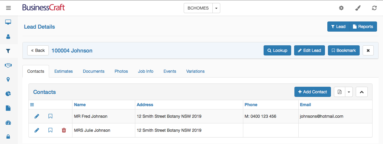
Lead Details Header
The Lead Details Header contains the name of the screen, a Lead button and a Reports button:

The Lead Button is a toggle that hides or shows the Lead Code and Name Panel that is positioned directly below the Lead Details Header. The Reports Button opens any reports created for Leads.
Lead Code and Name Panel
The Lead Code and Name Panel appears below the Lead Details Header and can be shown or hidden by clicking the Lead Button in the Lead Details Header or hidden by clicking the x icon in the Lead Code and Name Panel:

Click the Back button to return to the Leads List View.
Click the Lookup button to open Leads List View without leaving the Lead Details screen to quickly select another lead to be displayed in the Lead Details screen.
Click the Edit Lead button to edit the selected lead.
Click the Bookmark button to bookmark the Lead for display in the My Leads Detail Panel on the Desktop.
Contacts Tab/Panel
The Contacts Tab/Panel appears below the Lead Details Header and displays Contacts for this Customer for this Lead:

Click the Add Contact button to add a contact for this Lead.
Click the PDF icon to export the Contacts for this Lead.
Click the Up (or Down) arrow to expand or collapse the Contacts Tab/View.
The Hamburger icon is reserved for future use.
Click a column to sort the data by that column.
Drag and drop column headings to reposition columns in the grid.
Click the pencil to open a quick edit screen for the selected contact.
Click the bookmark icon for a contact so that the contact is displayed in its Desktop Panel.
Click the trash can to delete the selected contact. (The primary contact cannot be deleted)
Estimates Tab/Panel
The Estimates Tab/Panel appears below the Lead Details Header and displays Sales Estimates for this Lead:
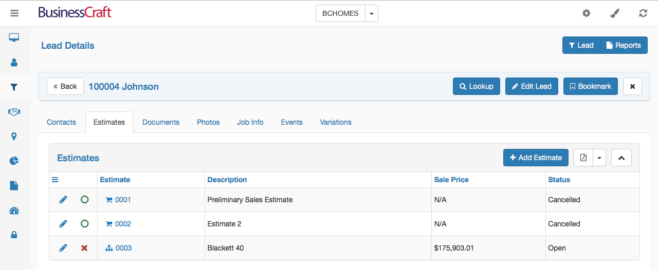
Click the Add Estimate button to add a Sales Estimate for this Lead.
Click the PDF icon to export the Estimates for this Lead.
Click the Up (or Down) arrow to expand or collapse the Estimates Tab/View.
The Hamburger icon is reserved for future use.
Click a column to sort the data by that column.
Drag and drop column headings to reposition columns in the grid.
Click the pencil to open a quick edit screen for the selected estimate.
Click the red x to cancel the estimate.
Click the Estimate hyperlink to open the Estimate Details screen.
The Estimate Details screen is explained in a separate section later in this guide.
Documents Tab/Panel
The Documents Tab/Panel appears below the Lead Details Header and displays Documents for this Lead.

Click the Add Document button to add a Document for this Lead.
Click the PDF icon to export the Documents for this Lead (excludes the attachments).
Click the Up (or Down) arrow to expand or collapse the Documents Tab/View.
The Hamburger icon is reserved for future use.
Click a column to sort the data by that column.
Drag and drop column headings to reposition columns in the grid.
Click the pencil to open a quick edit screen for the selected document.
Photos Tab/Panel
The Photos Tab/Panel appears below the Lead Details Header and displays Photos for this Lead.

Click the Grid or Gallery button to display Photos with details (Grid) or just photos (Gallery)
Click the Add Photo button to add a Photo for this Lead.
Click the PDF icon to export the Photos for this Lead (excludes the attachments).
Click the Up (or Down) arrow to expand or collapse the Photos Tab/View.
The Hamburger icon is reserved for future use.
Click a column to sort the data by that column.
Drag and drop column headings to reposition columns in the grid.
Click the pencil to open a quick edit screen for the selected photo.
Job Info Tab/Panel
The Job Info Tab/Panel appears below the Lead Details Header and displays Job Information for this Lead.
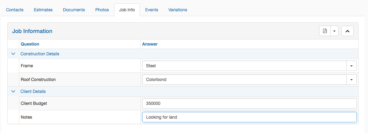
Click the PDF icon to export the Job Information for this Lead.
Click the Up (or Down) arrow to expand or collapse the Photos Tab/View.
Collapse or expand Job Information Categories using the Up/Down Arrows
Click in answer fields to answer questions.
Events Tab/Panel
The Events Tab/Panel appears below the Lead Details Header and displays Events for the workflow for this Lead.
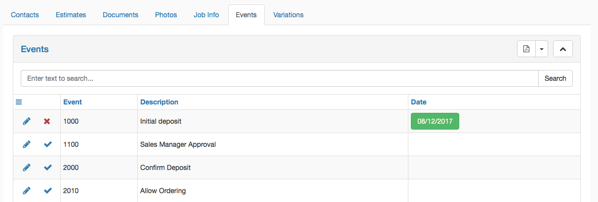
Click the PDF icon to export the Events for this Lead.
Click the Up (or Down) arrow to expand or collapse the Events Tab/View.
Click the pencil to open a quick edit screen for the selected event.
Click the tick to register the event. The Registration date will appear in Green
Click the red x to unregister the event (only if security permits)
Variations Tab/Panel
The Variations Tab/Panel appears below the Lead Details Header and displays Variations for this Lead.

Click the Add Variation button to add a Variation
Click the PDF icon to export the Variations for this Lead.
Click the Up (or Down) arrow to expand or collapse the Variations Tab/View.
Click the pencil to open a quick edit screen for the selected Variation.
Please note the Variations functionality is currently limited to creating Variation Header information and notes only for sales purposes.
Contracts
Click on the Contracts link in the Menu Sidebar to display the Contracts List View in the Data Grid. Contracts are segregated from Leads based on a system definable parameter.
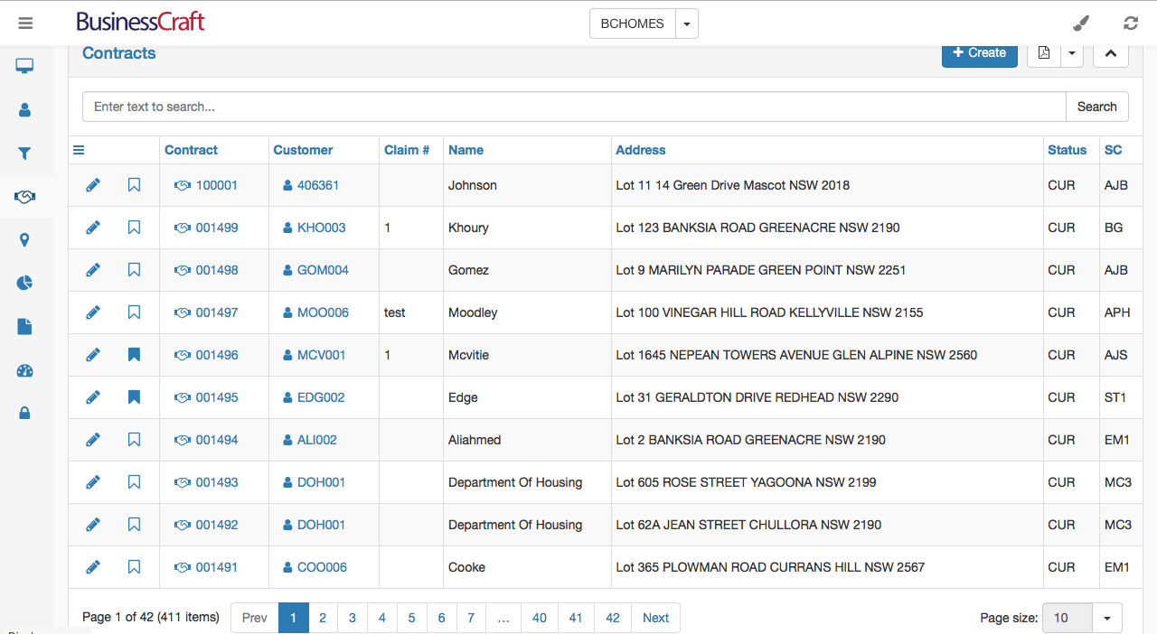
The Contracts List View contains a Heading Bar with the name of the page, a button to Create a Contract, an Export icon (PDF, XLS, XLSX, CSV, RTF) and an icon to collapse expand the view.
Below the Heading Bar, is the Search bar, providing the ability to carry out a text search for all records (not just those on the page displayed) for matching data in any of the columns in the List View.
Below the Search Bar is the Contracts List View Data Grid.
The Hamburger icon is reserved for future use.
Click a column to sort the data by that column.
Drag and drop column headings to reposition columns in the grid.
Click the bookmark icon for a record so that the record is displayed in its Desktop Panel
Click the Contract code hyperlink for a record to open the Contract Details screen.
Click the Customer code hyperlink for a record to open the Customer Details screen.
At the bottom of the screen is a Navigation Bar showing the number of pages and providing an option to change the number of records shown on each page:

Contract Details Screen
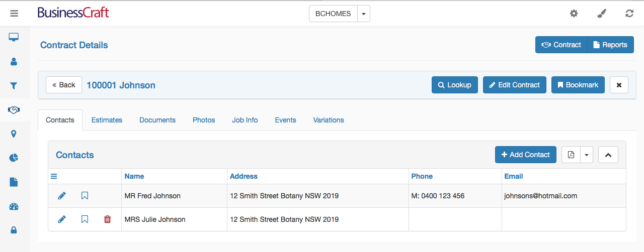
After clicking on a Contract Code for a record in the Contracts List View, the Contract Details screen is displayed. The Contract Details screen will display in either Tab or List View depending on the view last selected by clicking on the Settings Wheel in the Title Bar.
When in Tab view, the Contract Details screen will display the most recently opened tab. In this case, the Contacts Tab.
Contract Details Header
The Contract Details Header contains the name of the screen, a Contract button and a Reports button:

The Contract Button is a toggle that hides or shows the Contract Code and Name Panel that is positioned directly below the Contract Details Header. The Reports Button opens any reports created for Contracts.
Contract Code and Name Panel
The Contract Code and Name Panel appears below the Contract Details Header and can be shown or hidden by clicking the Contract Button in the Contract Details Header or hidden by clicking the x icon in the Contract Code and Name Panel:

Click the Back button to return to the Contracts List View.
Click the Lookup button to open Contracts List View without leaving the Contract Details screen to quickly select another contract to be displayed in the Contract Details screen.
Click the Edit Contract button to edit the selected contract.
Click the Bookmark button to bookmark the Contract for display in the My Contracts Detail Panel on the Desktop.
Contacts Tab/Panel
The Contacts Tab/Panel appears below the Contract Details Header and displays Contacts for this Customer for this Contract:

Click the Add Contact button to add a contact for this Contract.
Click the PDF icon to export the Contacts for this Contract.
Click the Up (or Down) arrow to expand or collapse the Contacts Tab/View.
The Hamburger icon is reserved for future use.
Click a column to sort the data by that column.
Drag and drop column headings to reposition columns in the grid.
Click the pencil to open a quick edit screen for the selected contact.
Click the bookmark icon for a contact so that the contact is displayed in its Desktop Panel.
Click the trash can to delete the selected contact. (The primary contact cannot be deleted)
Estimates Tab/Panel
The Estimates Tab/Panel appears below the Contract Details Header and displays Sales Estimates for this Contract:

Click the Add Estimate button to add a Sales Estimate for this Contract.
Click the PDF icon to export the Estimates for this Contract.
Click the Up (or Down) arrow to expand or collapse the Estimates Tab/View.
The Hamburger icon is reserved for future use.
Click a column to sort the data by that column.
Drag and drop column headings to reposition columns in the grid.
Click the pencil to open a quick edit screen for the selected estimate.
Click the red x to cancel the estimate.
Click the Estimate hyperlink to open the Estimate Details screen.
The Estimate Details screen is explained in a separate section later in this guide.
Documents Tab/Panel
The Documents Tab/Panel appears below the Contract Details Header and displays Documents for this Contract.

Click the Add Document button to add a Document for this Contract.
Click the PDF icon to export the Documents for this Contract (excludes the attachments).
Click the Up (or Down) arrow to expand or collapse the Documents Tab/View.
The Hamburger icon is reserved for future use.
Click a column to sort the data by that column.
Drag and drop column headings to reposition columns in the grid.
Click the pencil to open a quick edit screen for the selected document.
Photos Tab/Panel
The Photos Tab/Panel appears below the Contract Details Header and displays Photos for this Contract.

Click the Grid or Gallery button to display Photos with details (Grid) or just photos (Gallery)
Click the Add Photo button to add a Photo for this Contract.
Click the PDF icon to export the Photos for this Contract (excludes the attachments).
Click the Up (or Down) arrow to expand or collapse the Photos Tab/View.
The Hamburger icon is reserved for future use.
Click a column to sort the data by that column.
Drag and drop column headings to reposition columns in the grid.
Click the pencil to open a quick edit screen for the selected photo.
Job Info Tab/Panel
The Job Info Tab/Panel appears below the Contract Details Header and displays Job Information for this Contract.

Click the PDF icon to export the Job Information for this Contract.
Click the Up (or Down) arrow to expand or collapse the Photos Tab/View.
Collapse or expand Job Information Categories using the Up/Down Arrows
Click in answer fields to answer questions.
Events Tab/Panel
The Events Tab/Panel appears below the Contract Details Header and displays Events for the workflow for this Contract.

Click the PDF icon to export the Events for this Contract.
Click the Up (or Down) arrow to expand or collapse the Events Tab/View.
Click the pencil to open a quick edit screen for the selected event.
Click the tick to register the event. The Registration date will appear in Green
Click the red x to unregister the event (only if security permits)
Variations Tab/Panel
The Variations Tab/Panel appears below the Contract Details Header and displays Variations for this Contract.

Click the Add Variation button to add a Variation
Click the PDF icon to export the Variations for this Lead.
Click the Up (or Down) arrow to expand or collapse the Variations Tab/View.
Click the pencil to open a quick edit screen for the selected Variation.
Please note the Variations functionality is currently limited to creating Variation Header information and notes only for sales purposes.
Estimate Details Screen
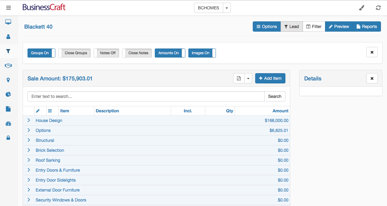
After creating an estimate or clicking on an existing Estimate hyperlink, the Estimate Details screen is displayed. A range of buttons and filters significantly change the appearance of the screen. In the following example of the Estimate Details screen, the blue buttons (except for the Reports and Add Item buttons), indicate the options switched on resulting in the screen appearance.
Estimate Details Screen Header

| Options |
When switched on, the Options button displays the Options Toolbar directly below the Lead Code Panel (if that Panel is displayed). The Options toolbar contains buttons for Groups On/Off, Groups Open/Closed, Notes On/Off, Notes Open/Closed, Amounts On/Off Images On/Off and Show All Pages/Paging. |
 |
|
| Lead |
When switched on, the Lead Button displays the Lead Code Panel below the Estimate Details Screen Header. A Back Button to the left of the Lead Code provides the option to return to the Estimate Details tab within the Lead Details screen. The Lead Code Panel contains buttons to Edit the Lead, Bookmark the Lead and an x icon to close the Lead Code Panel. |
 |
|
| Filter |
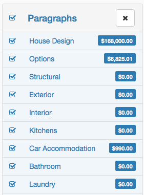
When switched on, the Filter button displays the Paragraphs Panel on the left-hand side of the Estimate Details Screen data grid. By default, all paragraphs are switched on, however they can all be toggled off with the checkbox in the Paragraphs Sidebar Header and then selectively switched on using the checkbox for the required paragraphs. Clicking on the text of a paragraph will select just that paragraph. |
 |
|
| Preview |
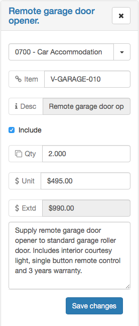
When switched on, the Preview button displays the Details Panel on the right-hand side of the Estimate Details Screen data grid. If available, details for the item selected in the Estimate Details Data Grid will be displayed in the Details Sidebar and can be edited. |
 |
|
| Reports | This option is reserved for future development. |
Options Toolbar
The Options Toolbar determines the manner in which information is displayed in the Estimate Details Screen Data Grid.

| Groups On/Off |
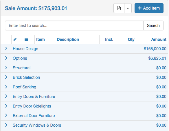
When switched on, the Groups On/Off button displays estimate details grouped by Paragraph. (Image on Left) When switched off, the Groups On/Off button displays estimate details sorted by Item Code. (Image on Right) |
 |
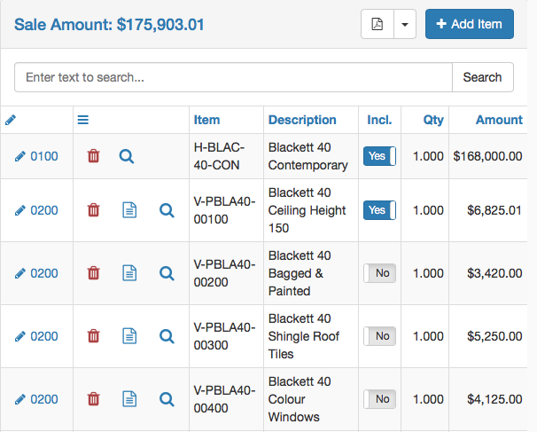 |
| Open/Close Groups |
Provided Groups are on, when the Open/Close Groups button is set to Open Groups, then the Groups will be open to display the items within the groups. (Image on Left) Provided Groups are on, when the Open/Close Groups button is set to Close Groups, then the Groups will be closed to hide the items within the groups. (Image on Right) |
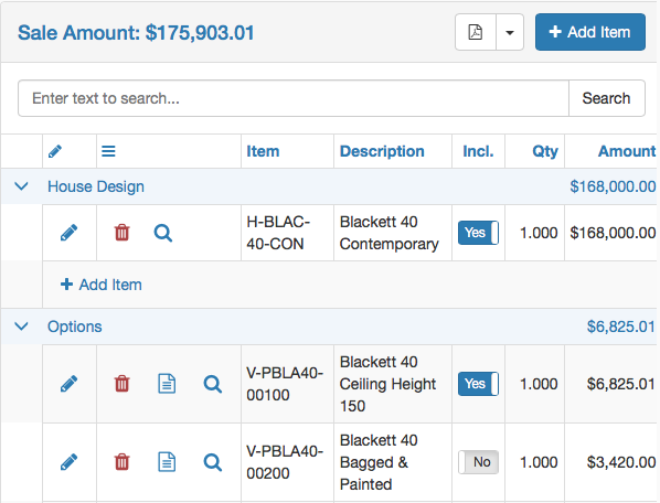 |
 |
| Notes On/Off |
When switched on, the Notes On/Off button hides the Notes Hover Icon in the Options Column and displays notes underneath each item. (Image on Left) When switched off, the Groups On/Off button displays the Notes Hover Icon in the Options column instead of displaying Notes underneath the item. (Image on Right) |
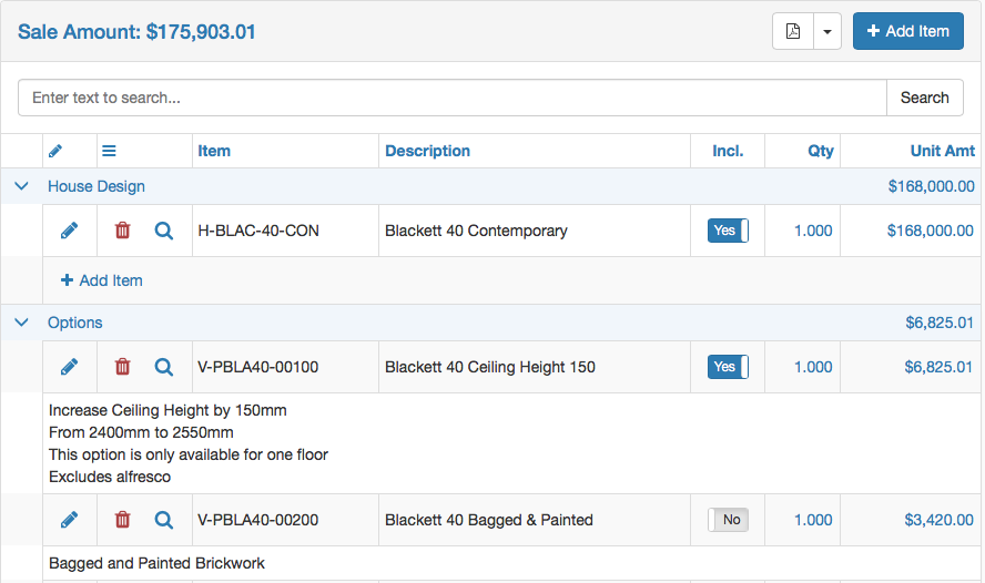 |
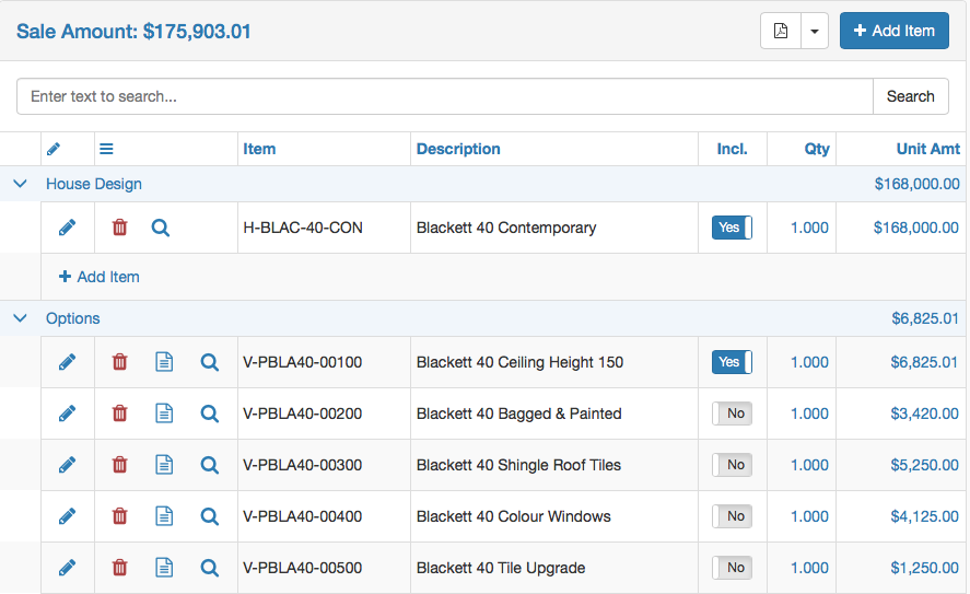 |
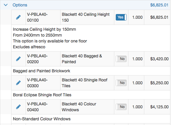
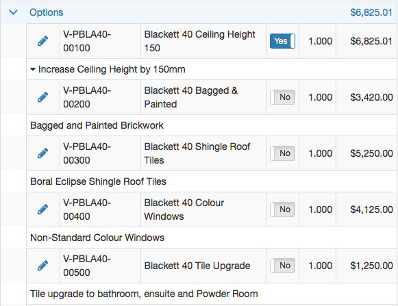
| Open/Close Notes |
Provided Notes are on, when the Open/Close Notes button is set to Open Notes, then Notes will be displayed in full. (Image on Left) Provided Notes are on, when the Open/Close Notes button is set to Close Notes, then only the first line of Notes will be displayed. A drop-down arrow will be displayed at the end of the first line to display full notes. (Image on Right) |
 |
 |
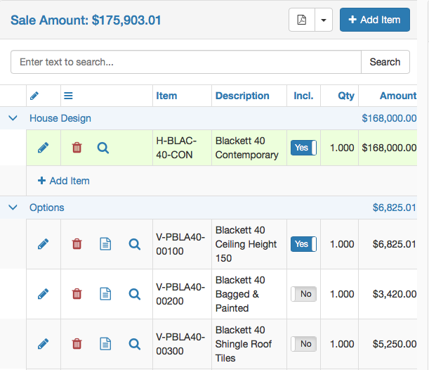
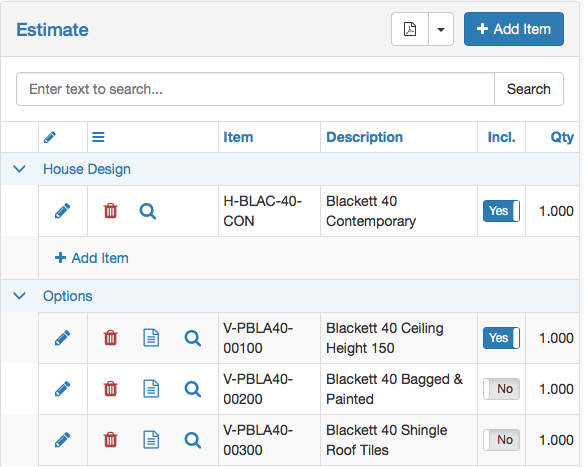
| Amounts On/Off |
When switched on, the Amounts On/Off button displays amounts for Estimate, Paragraphs, Groups, Items and in the Details Panel. (Image on Left) When switched off, the Amounts On/Off button does not display Amounts for Estimate, Paragraphs, Groups, Items or in the Details Panel. (Image on Right) |
 |
 |
| Images On/Off |
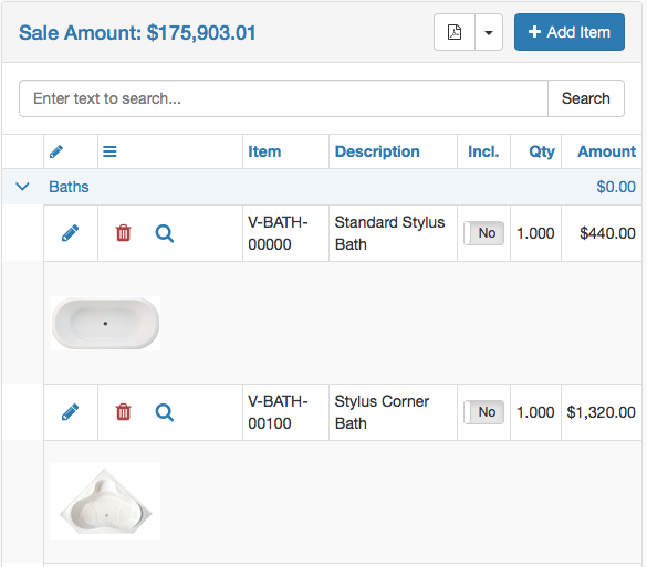
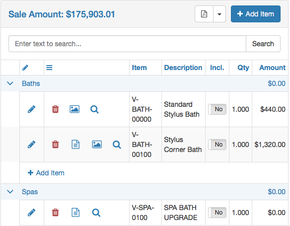
When switched on, the Images On/Off button displays images when available for items. (Image on Left) When switched off, the Images On/Off button does not display images for items even if available. However, if an image is available an image icon is displayed. Click the Image icon, to display the image. (Image on Right) |
 |
 |
| Show All/Paging |
When switched off (Show All), the Show All/Paging button will display all Paragraphs/Items in accordance with the Option switches and Paragraph selections. When switched on (Paging), the Show All/Paging button will display the first page of Paragraphs/Items in accordance with the Option switches and Paragraph selections. A Navigation Bar will be displayed at the bottom of the page, indicating the current page, the number of pages (and items), with the ability to select another page or go to the next page and an option to change the number of records shown on each page. |
Paragraphs Panel
When the Filter button is switched on, the Paragraphs panel is displayed on the left-hand side of the Estimate Details Data Grid.
The Paragraphs selected in the Paragraphs Panel determine the data displayed in the Estimate Details Data Grid. By default, all paragraphs are selected:
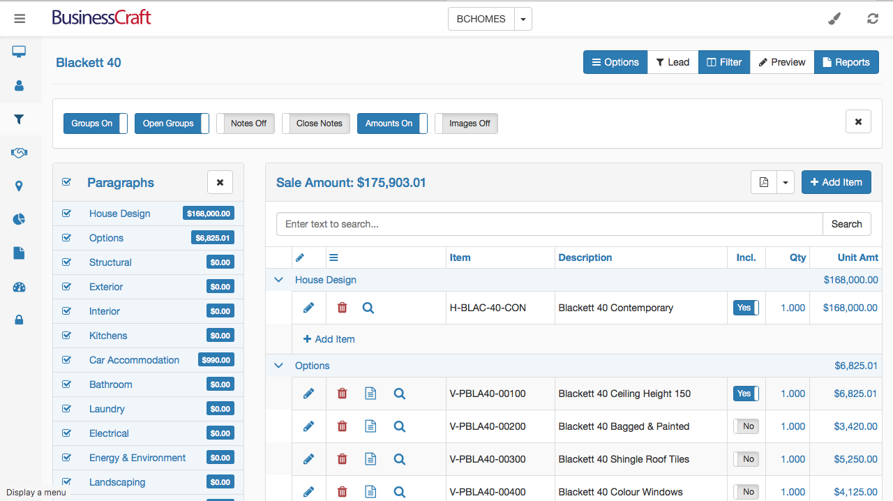
Uncheck the box in the Paragraphs Panel Header to deselect all paragraphs:
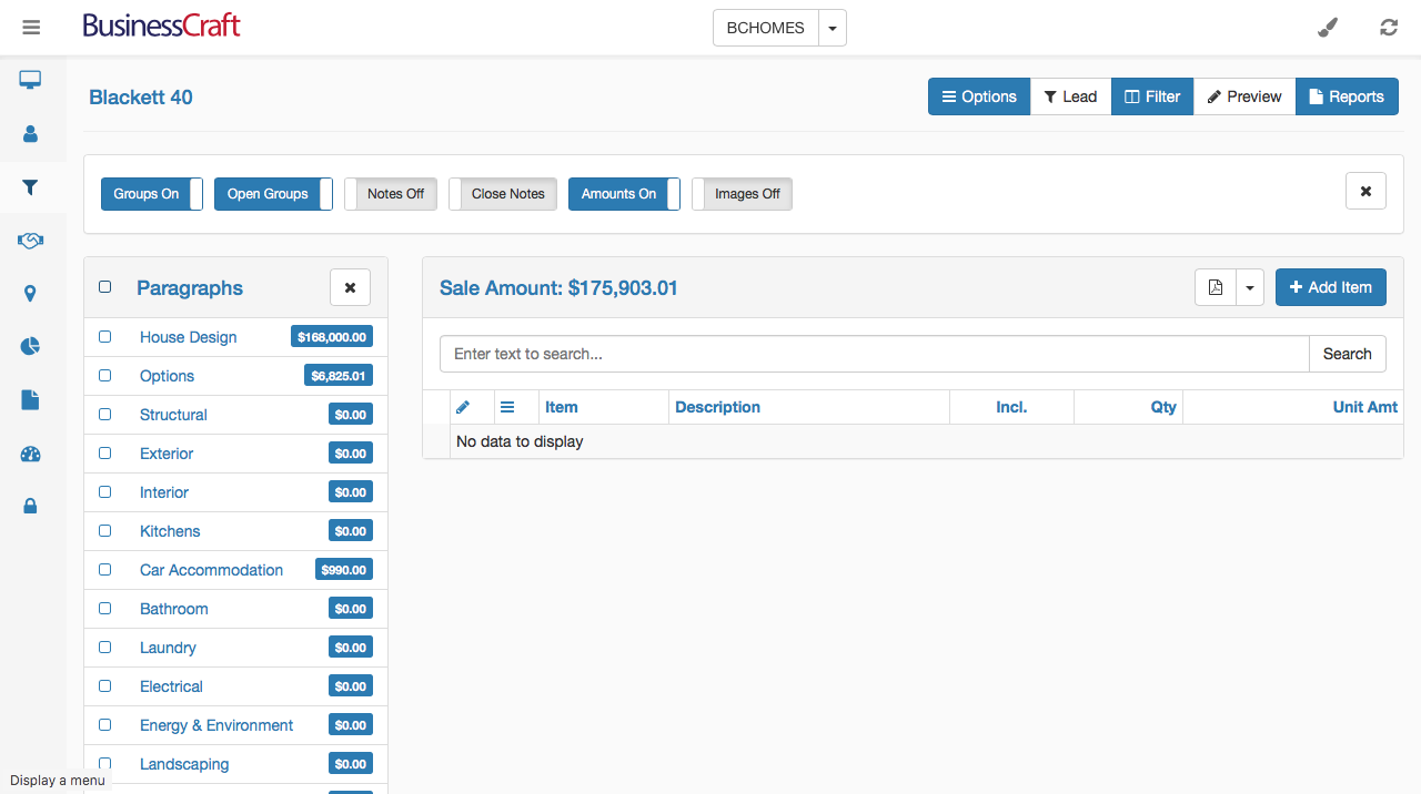
Re-check the box in the Paragraphs Panel Header to re-select all paragraphs.
Tick one or more checkboxes next to the Paragraphs to select just those paragraphs for display:
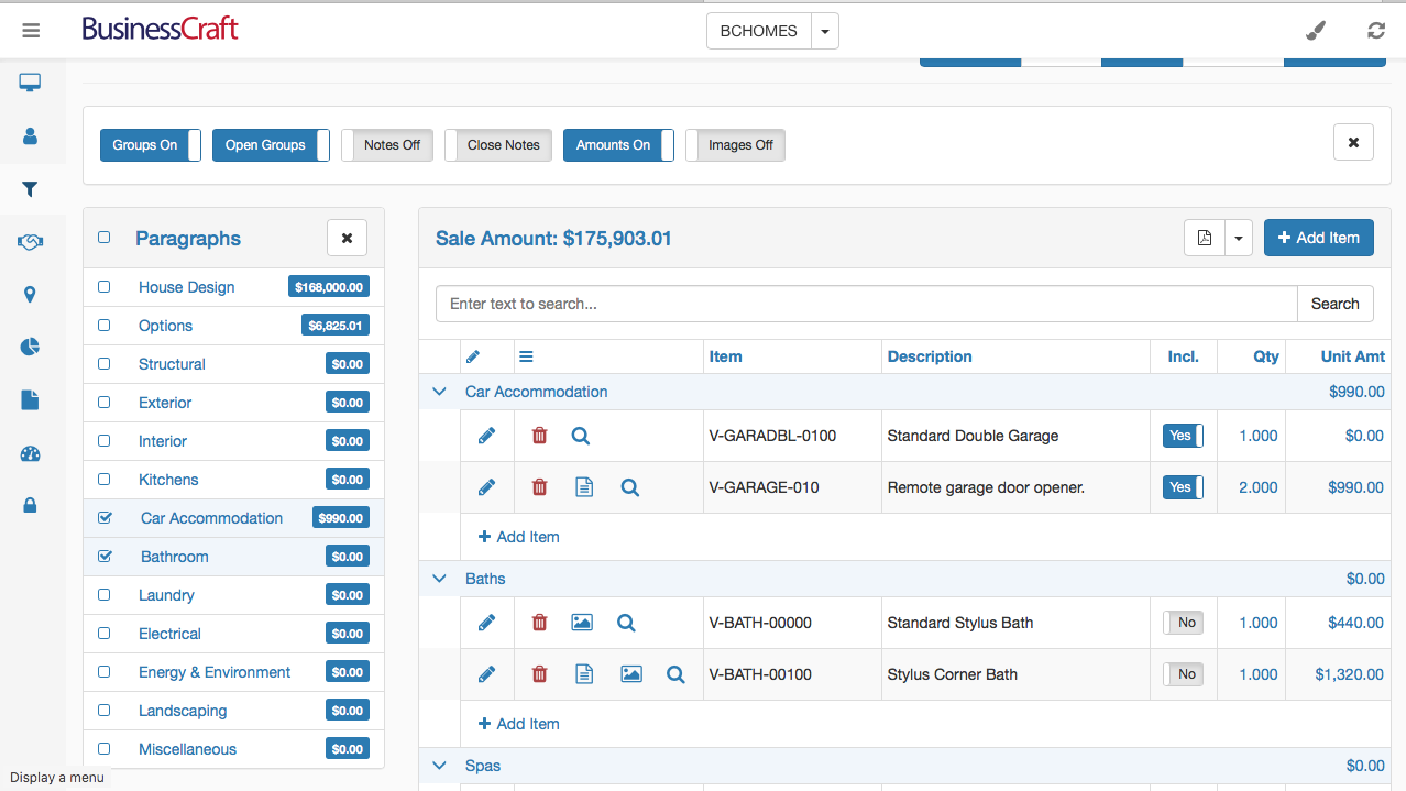
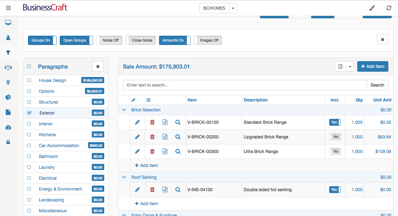
To select just one paragraph quickly, click the text for the paragraph. To select another paragraph, click the text for that paragraph and the currently selected paragraph will be deselected and the paragraph text clicked will be selected and displayed:
Estimate Details Panel
The Estimates Details Panel is displayed in the centre of the Estimate Details Data Grid. The Paragraphs Panel is displayed to the left of the Estimate Details Panel if the Filter Button is switched on and the Details Panel is displayed to the right of the Estimate Details Panel if the Preview button is switched on.
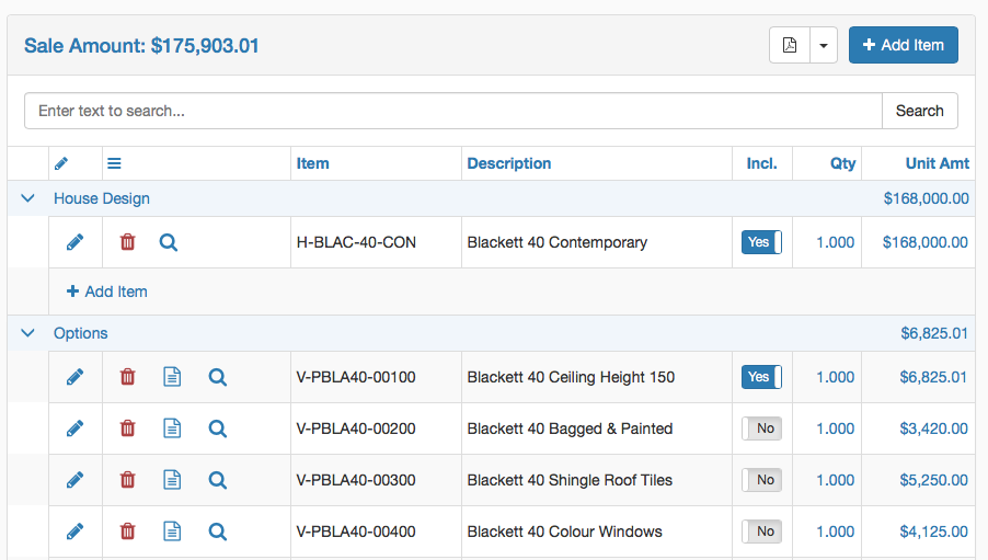
The data displayed in the Estimate Details Panel will be determined by the switches in the Options Toolbar and the Paragraphs selected in the Paragraphs Panel:
Estimate Detail Panel Header
The Estimate Detail Panel Header contains the Estimate Name and the Total Value of the Estimate if the Amounts switch is on.

The Export icon provides the option to export the estimate in a variety of file types. (PDF, XLS, XLSX, CSV, RTF).
The Add Item button opens the New Estimate Detail Line screen so that an item can be added to the estimate. When choosing to Add an Item with the button in the Estimate Detail Panel Header, the Paragraph will need to be selected in the New Estimate Detail Line screen.
Search Bar
The Search Bar provides the ability to wild card search for matching text in the Item and Descriptions fields in the estimate. If Paging is switched on, the Search will still search all pages not just the current page.

Estimate Detail Panel Columns

Click the pencil to open a quick edit screen for the selected item.
The Hamburger icon identifies the Options Column. The available options (subject to Options Toolbar settings) for the selected record include Delete, Notes Hover, Image Display and an Item Lookup function.
The Incl. column is used to indicate whether the selected record and its extended price is included in the estimate (Yes) or not (No)
Click a column to sort the data by that column.
Drag and drop column headings to reposition columns in the grid.
Click the Add Item option at the bottom of a Paragraph to open the New Estimate Detail Line screen and add an item to that paragraph.
New Estimate Detail Line screen
Click the Add Item button in the Estimate Details Panel Header or from within a Paragraph to open the New Estimate Detail Line screen:
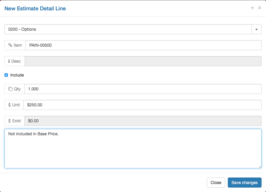
If required, select the correct paragraph from the drop-down list.
Commence typing in the Item field and a wild card search of the Item Code and Item Description fields will provide a list of matching items to choose from.
Tick the Include checkbox to have this item include in the estimate price.
Enter the Item Quantity.
Leave the Unit Price field blank for the default price for the item to be used, enter zero for no charge or enter a specific price if required.
Record any additional notes required.
Click the Save Changes button to save the record and add it to the Paragraph in the Estimate.
Details Panel
When the Preview button is switched on, the Detail panel is displayed on the right-hand side of the Estimate Details Data Grid. Details will be displayed for the selected item and can be edited and saved.
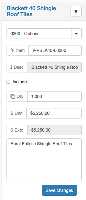
Click the Preview button or the x in the Details Panel Header to hide the panel.
If the Details Panel is closed, the Quantity and Unit Amount fields become hyperlinks allowing in line editing of the selected record. After using in line editing click the green tick to save or the red x to cancel:

Displays
Click on the Displays link in the Menu Sidebar to open the Displays List View in the Data Grid.
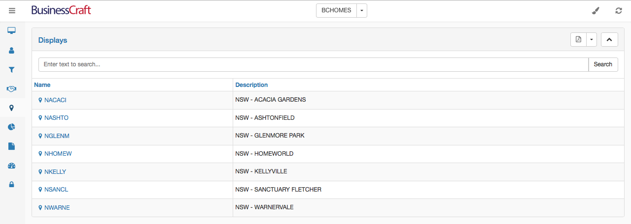
The Displays List View contains a Heading Bar with the name of the page, an Export icon (PDF, XLS, XLSX, CSV, RTF) and an icon to collapse expand the view.
Below the Heading Bar, is the Search bar, providing the ability to carry out a text search for all records (not just those on the page displayed) for matching data in any of the columns in the List View.
Click a column to sort the data by that column.
Click the Name hyperlink for a record to open the Display Centre Information screen.
Display Centre Information Screen
After clicking on a Display Name for a record in the Display List View, the Display Centre Information screen is opened for the current date. The Display Centre Information screen is used to record/view daily data for the Display Centre:
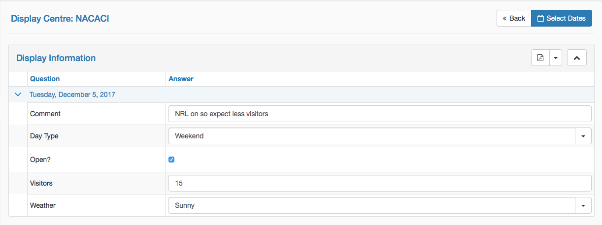
Click the Back Button to return to the Displays List View.
Click the Select Dates button to choose a different date.
To choose a range of dates, click the Select Dates button, then click the first date to be selected and drag to the last date to be selected.
Charts
Click on the Charts link in the Menu Sidebar to display the Charts List View in the Data Grid. Charts can be bookmarked which makes the chart available for display on the Desktop.

The Charts List View contains a Heading Bar with the name of the page, a button to Add a Chart, an Export icon (PDF, XLS, XLSX, CSV, RTF) and an icon to collapse expand the view.
Below the Heading Bar, is the Search bar, providing the ability to carry out a text search for all records (not just those on the page displayed) for matching data in any of the columns in the List View.
Below the Search Bar is the Charts List View Data Grid.
The Hamburger icon is reserved for future use.
Click a column to sort the data by that column.
Drag and drop column headings to reposition columns in the grid.
Click the pencil to edit chart details
Click the bookmark icon for a chart so that the chart is available for display in the Desktop
Click the trash can icon to delete the chart.
Click the Chart Name hyperlink to view the chart.
At the bottom of the screen is a Navigation Bar showing the number of pages and providing an option to change the number of records shown on each page:

After clicking the pencil for a chart, the chart is displayed:
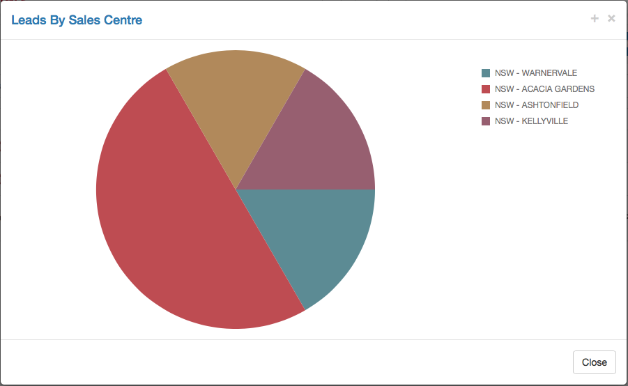
Chart Details Screen
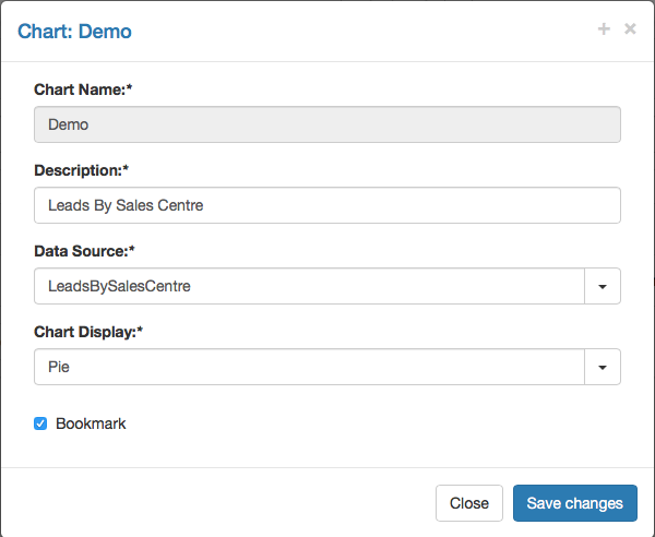
After clicking the pencil to edit a chart, the chart details screen is displayed. Care should be taken when changing chart details as the impact is not only on the chart but on desktops that use the chart:
Reports
Click on the Reports link in the Menu Sidebar to display the Reports List View in the Data Grid.
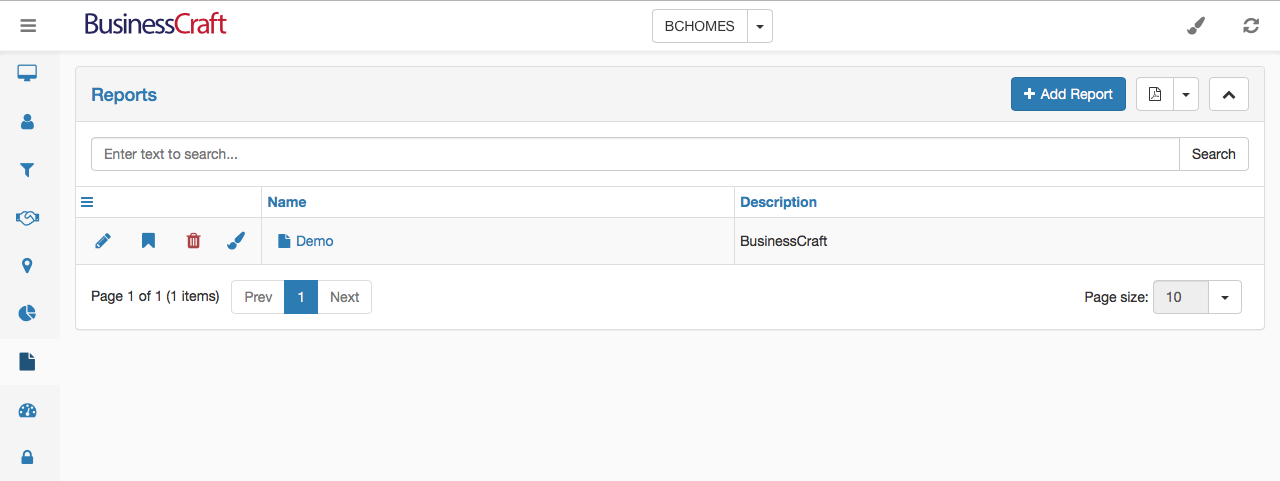
The Reports List View contains a Heading Bar with the name of the page, a button to Add a Report, an Export icon (PDF, XLS, XLSX, CSV, RTF) and an icon to collapse expand the view.
Below the Heading Bar, is the Search bar, providing the ability to carry out a text search for all records (not just those on the page displayed) for matching data in any of the columns in the List View.
Below the Search Bar is the Reports List View Data Grid.
The Hamburger icon is reserved for future use.
Click a column to sort the data by that column.
Drag and drop column headings to reposition columns in the grid.
Click the pencil to edit report details
The bookmark icon is reserved for future use.
Click the trash can icon to delete the report.
Click the Report Name hyperlink to run and view the report.
At the bottom of the screen is a Navigation Bar showing the number of pages and providing an option to change the number of records shown on each page:

Report Details Screen
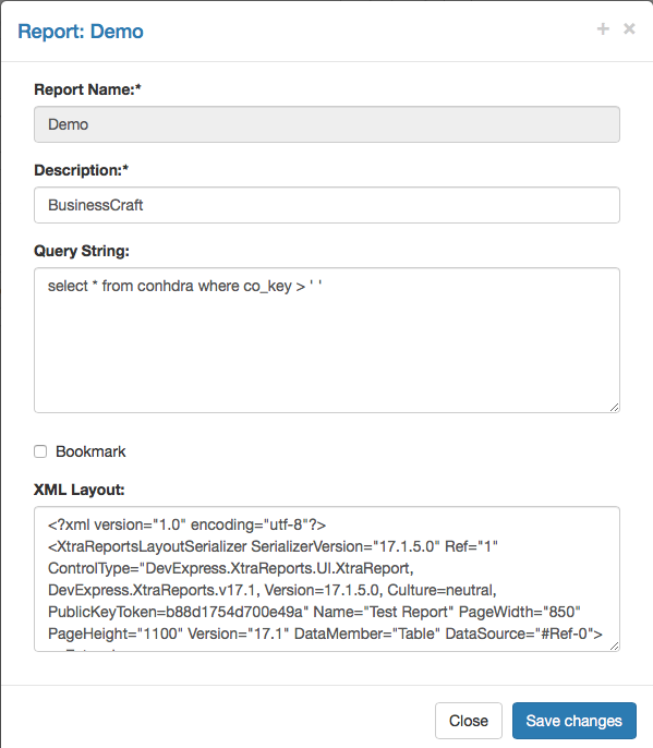
After clicking the pencil to edit a report, the report details screen is displayed. Care should be taken when changing report details as the impact is not only on the report but on modules that use the report:
Further details on using the Reports functionality will be covered when development is completed for reports.
Dashboards
Click on the Dashboards link in the Menu Sidebar to display the Dashboards List View in the Data Grid.
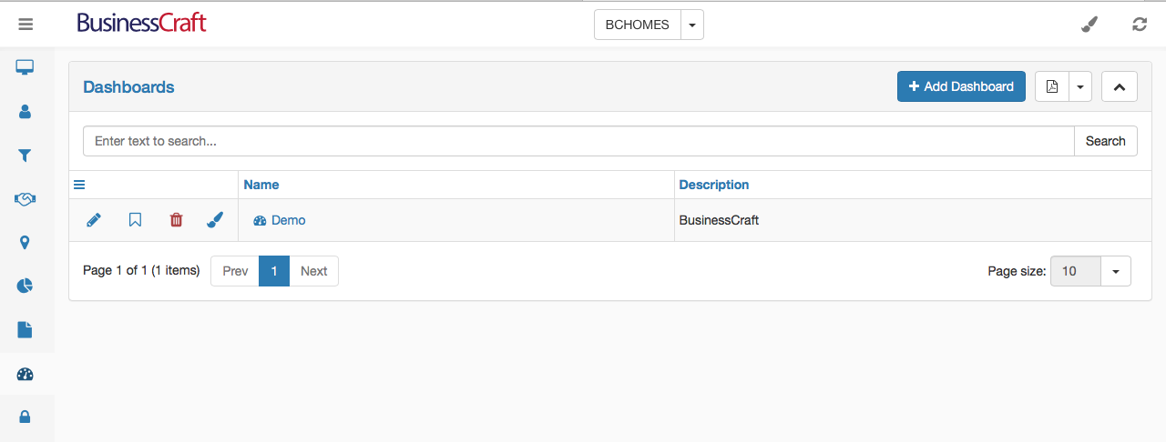
The Dashboards List View contains a Heading Bar with the name of the page, a button to Add a Dashboard, an Export icon (PDF, XLS, XLSX, CSV, RTF) and an icon to collapse expand the view.
Below the Heading Bar, is the Search bar, providing the ability to carry out a text search for all records (not just those on the page displayed) for matching data in any of the columns in the List View.
Below the Search Bar is the Dashboards List View Data Grid.
The Hamburger icon is reserved for future use.
Click a column to sort the data by that column.
Drag and drop column headings to reposition columns in the grid.
Click the pencil to edit dashboard details.
The bookmark icon is reserved for future use.
Click the trash can icon to delete the chart.
Click the Dashboard Name hyperlink to view the Dashboard.
At the bottom of the screen is a Navigation Bar showing the number of pages and providing an option to change the number of records shown on each page:

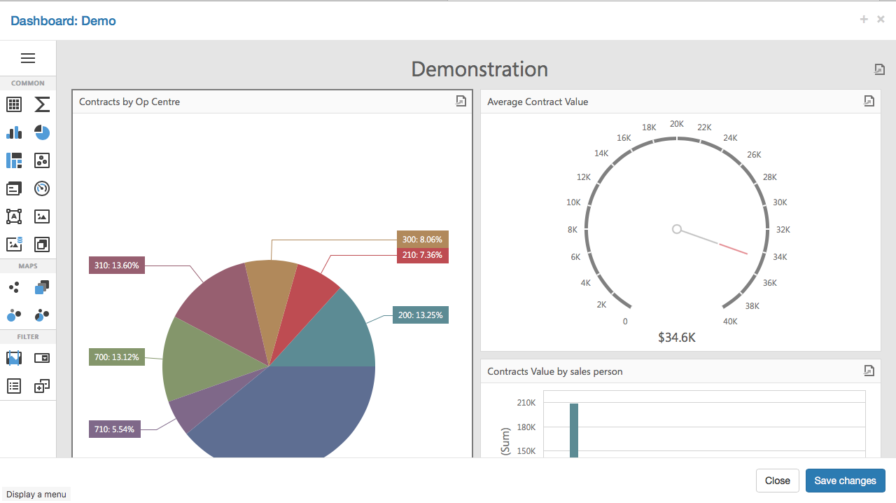
Dashboard Designer
After clicking the brush for a dashboard, the Dashboard Design screen is opened:
Dashboard Details Screen
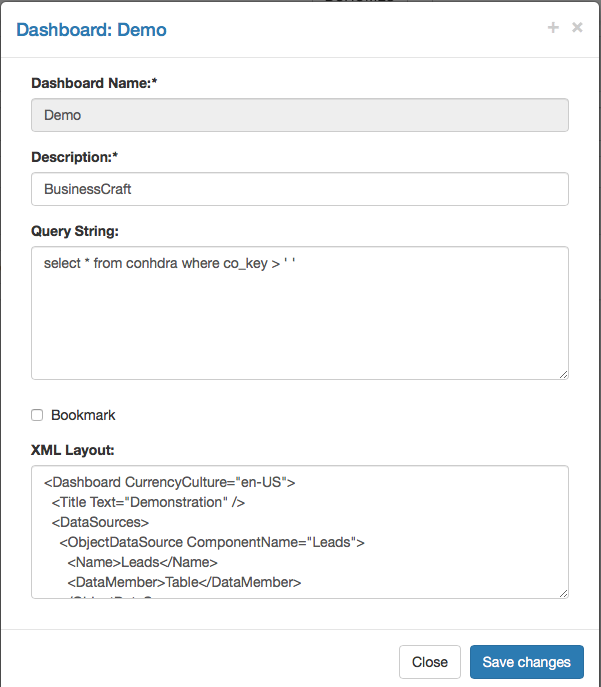
After clicking the pencil to edit a dashboard, the dashboard details screen is displayed:
Administration
This page is currently under development.
Revision 1
8th December 2017